
June 1, 2026
The Hidden Leaks Draining Your Landing Page Conversions
Most B2B landing pages are leaky buckets masquerading as lead generation assets. Companies spend thousands of dollars driving high-intent traffic via paid search and paid social, only to watch conversion rates hover at a miserable 2% to 3%. The standard response to a underperforming campaign is almost always to tweak the ad creative or boost the ad spend. This is a costly misdiagnosis.

Damien
DESIGN. IDENTITY. SCALE.
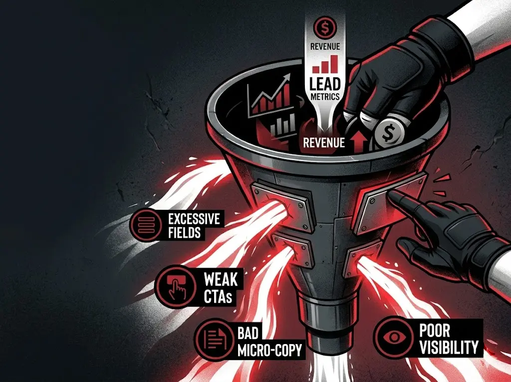
The real failure points live directly on the page. Traditional landing pages are built with internal corporate biases rather than user psychology in mind. They subject prospects to unnecessary friction, demanding too much cognitive effort and data upfront before delivering any tangible value. When a visitor lands on your page, a invisible countdown timer begins. Every confusing sentence, redundant form field, and poorly placed button accelerates their exit.
To build a high-converting funnel, you must ruthlessly eliminate the psychological and technical friction points that cause qualified prospects to bounce.
| Friction Element | The Standard Approach (Low Conversion) | The Frictionless Approach (High Conversion) | Impact on Conversion Rate |
| Form Fields | 7-10 fields demanding phone, company size, and job title. | 2-3 fields or multi-step progressive profiling. | 25% – 50% increase in form completions. |
| Call to Action | Vague phrases like “Submit,” “Learn More,” or “Request Demo.” | Benefit-driven, high-contrast buttons mirroring the user’s immediate goal. | 10% – 20% lift in click-through rate. |
| Micro-copy | Generic compliance language or zero reassurance below input fields. | Objection-handling text addressing privacy, spam, and time commitments. | Reduces form abandonment by up to 15%. |
| CTA Placement | Buried below a massive hero image or hidden at the bottom of the page. | Sticky navigation CTAs combined with strategic contextual placements. | Ensures 100% visibility regardless of scroll depth. |
The 4-Step Playbook for Eliminating Conversion Friction
Fixing a leaky funnel requires tactical adjustments to form design, copywriting, and visual hierarchy. Implement these four structural overhauls to salvage lost leads and maximize your return on ad spend.
1. Execute Radical Form Field Reduction
Every single input field you add to a landing page drastically reduces your conversion rate. B2B marketing teams routinely kill their own campaigns by forcing prospects to fill out exhaustive dossiers just to download a whitepaper or book an initial discovery call. Sales teams want qualified data, but demanding it all upfront ensures you get no data at all.
- Audit Your Forms: Look at your current layout. If you are asking for company name, job title, phone number, website URL, and annual revenue on the initial touchpoint, cut it immediately.
- Enforce a Three-Field Maximum: For top-of-funnel and middle-of-funnel offers, stick strictly to Name, Work Email, and the single most critical qualifying question (e.g., “What is your biggest operational bottleneck?”).
- Deploy Progressive Profiling: Use smart form infrastructure. If a returning lead interacts with a secondary asset, your marketing automation system should automatically hide the fields they already completed and replace them with new qualifying questions.
- Shift to Multi-Step Forms: If you absolutely require deep data to price a service, break the form into a multi-step experience. Ask one or two low-friction, non-invasive questions first (e.g., “What industry are you in?”). Once a user commits to the first step, psychological momentum carries them through the subsequent fields.
2. Overhaul Weak, Passive Calls to Action
A button that says “Submit” is not a call to action; it is an administrative instruction. It focuses entirely on what the user has to give up (their data and time) rather than what they stand to gain.
- Align the CTA with the Cognitive Reward: Replace generic verbs with explicit, value-forward promises. If your landing page offers a custom growth audit, the button should read “Get My Free Growth Audit,” not “Download Now.”
- Use First-Person Perspective: Testing consistently shows that changing button copy from the second person (“Get your plan”) to the first person (“Get my plan”) yields immediate conversion lifts. It triggers a psychological sense of ownership over the asset.
- Design for Visual Dominance: Your CTA button must be impossible to miss. Use a high-contrast color that exists nowhere else in your brand’s primary color palette. Ensure the button has ample negative space around it so it doesn’t get swallowed by surrounding text or imagery.
3. Deploy High-Impact Micro-copy to Destroy Cognitive Friction
Micro-copy refers to the small words around input fields, inside placeholder text, and directly underneath buttons. Most companies leave these spaces blank or fill them with sterile compliance legalese. This is a massive missed opportunity to handle objections at the precise moment of greatest user hesitation.
- Neutralize Spam Anxieties: The second a prospect contemplates entering their email address, they anticipate an inbox bombardment. Mitigate this instantly with a line of micro-copy right below the email field: “Zero spam. Unsubscribe in one click.”
- Set Clear Time and Effort Expectations: If you want someone to book a demo or watch a video, tell them exactly how long it will take. Underneath a booking CTA, add: “Takes less than 45 seconds. No credit card required.”
- Humanize Placeholder Text: Instead of leaving form fields blank or using generic labels like “Email Address,” use conversational placeholders that guide the user. For example, use “you@company.com” to subtly signal that you require a professional business email rather than a personal Gmail account.
4. Optimize CTA Placement for Dynamic User Behavior
Placing a single CTA button at the very top of your landing page and another at the dead bottom is a recipe for missed conversions. Users do not read landing pages like books; they skim them aggressively. If a prospect becomes convinced of your value proposition halfway down the page, they should not have to hunt for a way to take action.
- Implement a Persistent Sticky Header: As the user scrolls past the initial hero section, a minimalist navigation bar should lock to the top of the viewport. This header must contain one prominent, high-contrast CTA button. The opportunity to convert must remain exactly one click away at all times.
- Embed Contextual CTAs Post-Validation: Do not rely solely on the hero section. Place inline CTA blocks immediately following your strongest social proof or case study sections. When a user reads a quote from a client who doubled their revenue using your framework, their buying intent peaks. Strike while the iron is hot.
Critical Warning: If your landing page requires a user to scroll back to the top of the screen just to find your form, your mobile conversion rates are likely actively cratering. Mobile users have zero tolerance for navigational backtracking.
The Two-Step Value Flip Strategy
The most significant competitive advantage in conversion rate optimization lies in reversing the traditional psychological transaction of the landing page.
Ninety percent of B2B landing pages operate on a “Delayed Value” model. They force the user to pay a toll—in the form of contact information, time, or attention—before unlocking any value. This creates immediate cognitive resistance. To gain a massive edge over your competitors, you must flip this sequence entirely through an approach known as the Two-Step Value Flip.
Instead of gating your insight behind a form, deliver a high-value, highly specific, un-gated interactive tool or proprietary data insight directly on the page for free.
[Traditional Model] -> User Gives Data -> Long Wait -> Receive Generic Asset
[Value Flip Model]  -> User Interacts With Free Value Tool -> Instant Micro-Insight -> Input Data to Unlock Full Blueprint
For example, if you are selling an enterprise SEO solution, do not use a standard landing page that says “Fill out this form to talk to an SEO expert.” Instead, build a lightweight, functional input field right in the hero section where a prospect can type in their main competitor’s URL.
The moment they hit enter, run a script that displays three immediate, glaring SEO vulnerabilities their competitor is exploiting. No email required. No gate.
Once the prospect sees the instant, hyper-personalized proof of your capability, you present the actual conversion hook: “We mapped out the exact 90-day playbook to neutralize these 3 vulnerabilities and capture this traffic. Enter your work email to receive the complete technical blueprint.”
By shifting the relationship from a demand for data to a demonstration of immediate utility, you eliminate the inherent skepticism that plummets standard landing page conversion rates. You are no longer asking them to trust a vague marketing promise; you have already proven your value in real-time.