
June 2, 2026
The Visual Red Flags Stripping Your Site of Authority
Prospects judge your business capability before they read a single line of your value proposition. In exactly three seconds, the human brain processes the visual hierarchy, typographic weight, and layout stability of your landing page, rendering a subconscious verdict on your professionalism. If your user interface (UI) flashes clunky layouts, illegible font pairings, or erratic loading shifts, users bounce. They do not rationalize that your backend tech is superior; they assume a sloppy interface equals a sloppy product.

Damien
DESIGN. IDENTITY. SCALE.
Most B2B sites hemorrhage conversion rates not because their pricing is wrong, but because their visual interface triggers immediate cognitive friction. This friction acts as a silent tax on your ad spend and outbound efforts. To capture and hold enterprise-level intent, your UI must project absolute operational dominance the moment pixels hit the screen.
The Expensive Lie of “Aesthetic-First” Design Systems
The most destructive mistake growth companies make is prioritizing subjective artistic flair over predictable visual mechanics. Design teams spend weeks obsessing over abstract color gradients and custom micro-animations while completely ignoring layout stability and readable information density. This creates a critical disconnect: your site looks like an art project but functions like a labyrinth.
[Artistic/Vague Hero Asset] -> Causes Cognitive Loading -> High Bounce Rate (60%+)
[Structured/High-Density UI] -> Lowers Cognitive Load  -> High Engagement (20%+ lift)
When a user lands on your page, their brain asks three immediate questions: Where am I? What can I do here? What do I do next?
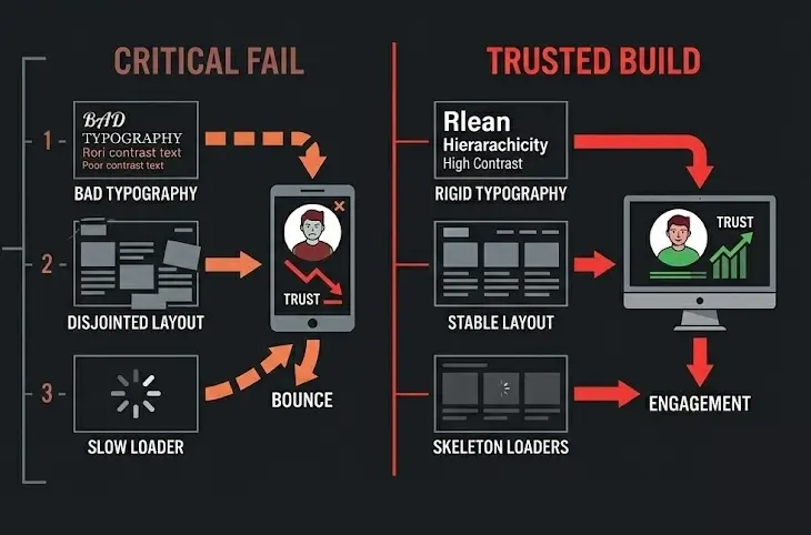
If your UI elements are competing for attention with equal visual weight, you force the user to work to find the answers. This structural failure manifests in three specific ways:
- The Typography Dump: Mixing three or more disparate font families or using insufficient contrast ratios that make scanning impossible under standard office lighting.
- The Unstable Layout: Elements that shift violently during asset loading, forcing users to misclick or lose their place before the page settles.
- The “Mystery Meat” Navigation: Hiding critical conversion paths inside ambiguous icons or avant-garde layouts that sacrifice clarity for novelty.
Contrarian Danger Zone: If your design team defends a layout by saying “it looks clean” even though it hides core product capabilities or pricing entry points, fire the agency that built it. Aesthetics without immediate utility is just expensive friction.
The Three-Part UI Execution Framework for Instant Conversion Stability
To systematically eliminate user bounce rates within the first three seconds, you must optimize for layout predictability, typographical hierarchy, and structural speed. Implement this exact three-step engineering and design playbook to lock down user trust immediately.
1. Hardcode Your Visual Hierarchy with Strict Typographical Scaling
Stop letting designers eyeball font sizes. Implement a rigid mathematical scale (such as a 1.250 Major Third scale) to create an undeniable psychological order on the page. Your H1 must command the screen, your H2s must clearly delineate new value pillars, and your body copy must be optimized for effortless scanning.
| Element | Desktop Size | Mobile Size | Line Height | Purpose |
| H1 Hero Heading | 48px – 60px | 32px – 36px | 1.1 – 1.2 | Immediate hook; states absolute utility. |
| H2 Section Heading | 32px – 38px | 24px – 28px | 1.2 – 1.3 | Structural anchors for scrolling scanners. |
| Body Copy | 16px – 18px | 15px – 16px | 1.5 – 1.6 | High-readability retention text. |
| Micro-Copy/Labels | 12px – 14px | 12px | 1.4 | Technical data, forms, and secondary context. |
Ensure your text contrast hits a minimum ratio of 4.5:1 against its background for standard text, and 3:1 for large text. Anything less forces the eye to strain, causing the user to exit without realizing why.
2. Eradicate Core Web Vitals Layout Shifts
A page that loads quickly but moves erratically is worse than a page that loads slightly slower but remains rock-solid. Visual stability is measured via Cumulative Layout Shift (CLS). A high CLS score instantly signals a broken, amateur platform.
- Reserve Aspect Ratio Slots: Always explicitly define height and width attributes for images, videos, and ad containers in your CSS. Never let the browser calculate the dimensions on the fly.
- Style Your Skeleton Loaders: Replace generic, spinning loading wheels with content placeholders that match the exact structural layout of the incoming data. Spinning wheels signal delay; skeletons signal progress.
- Font Swapping Isolation: Use
font-display: swap;correctly, but pair it with a system font fallback that closely matches the geometry of your custom web font to prevent layout jumps when the primary font loads.
3. Deploy High-Contrast, Single-Intent Action Regions
Within three seconds, a user must see exactly where their focus should go. If your primary Call to Action (CTA) blends into your background or competes with three other secondary ghost buttons, you split your conversion intent.
[WRONG]: [ Primary CTA (Blue) ]   [ Secondary CTA (Light Blue) ]   [ Tertiary CTA (White) ]
[RIGHT]:   [ Primary CTA (Orange) ] [ Secondary CTA (Transparent Outline) ]
Isolate your primary action asset. Use a high-contrast accent color reserved exclusively for conversions. Surround this element with a minimum of 24px of whitespace to give it visual breathing room and prevent accidental clicks on mobile layouts.
The “Information Density” Paradox: Why Minimalist Whitespace is Killing Your B2B Conversions
The modern web design industry is obsessed with sweeping, minimalist layouts featuring massive fields of empty whitespace and giant, ambiguous hero imagery. While this approach works perfectly for luxury fashion brands or consumer lifestyle goods, it is actively destroying conversions for complex B2B services and technical software platforms.
Enterprise buyers, mid-market executives, and technical procurement officers do not browse your site to feel a minimalist vibe. They visit your site on a mission to solve a specific, high-stakes operational problem.
When you present them with a massive, empty viewport containing only a vague four-word headline and no immediate technical substance, you trigger suspicion. They suspect your product lacks depth, or worse, that you are hiding a lack of functionality behind slick branding.
The High-Density Play: Increase your initial above-the-fold information density by 20% to 30%. Instead of an empty, artistic lifestyle image in your hero section, display a crisp, high-fidelity screenshot of your actual software interface or a clear, data-backed architectural diagram of your operational process.
Pair this density with immediately visible validation signals: explicit integration logos, verified processing metrics, or live performance counters. By presenting high-value, organized information immediately upon page load, you satisfy the user’s need for logical proof within those critical first three seconds. You prove instantly that your platform possesses the structural integrity required to handle their business.